
This article focuses on the extraction of time series farm-level crop health index such that the farms with low health index can be identified for various time periods. The data sets used are extracted from the SatSure Sparta web platform.
Crop Health Index is deduced by scaling the Normalized Differential Vegetation Index (NDVI). NDVI ranging from -1 to +1 (+1 being dense vegetation) is scaled by multiplying and adding 100 to give a health index which ranges from 0 to 200.
SatSure Sparta uses Copernicus Sentinel-2 satellite data source to obtain a health index.
METHODOLOGY
The above-mentioned steps are followed in order to identify individual farms with low health index. Further, in this article, the whole process is explained in detail.
SOFTWARE AND TOOLS REQUIRED:
Satsure Sparta: Open-source web platform to extract sub-district level health index data for different time periods.
QGIS: Open source GIS software for processing and analysing the data
Tools:
- Clip Raster – It is used to cut a portion of the dataset to a required extent.
- Zonal Statistics – It is used to assign the calculated statistic from a raster dataset to a zonal shapefile. Each zone will have one particular value obtained from the underlying raster dataset.
- Symbology – It is used to visualise the data.
- Definition Query – It is used to customise output based on certain parameters.
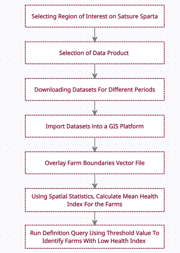
STEPS TO DOWNLOAD DATA
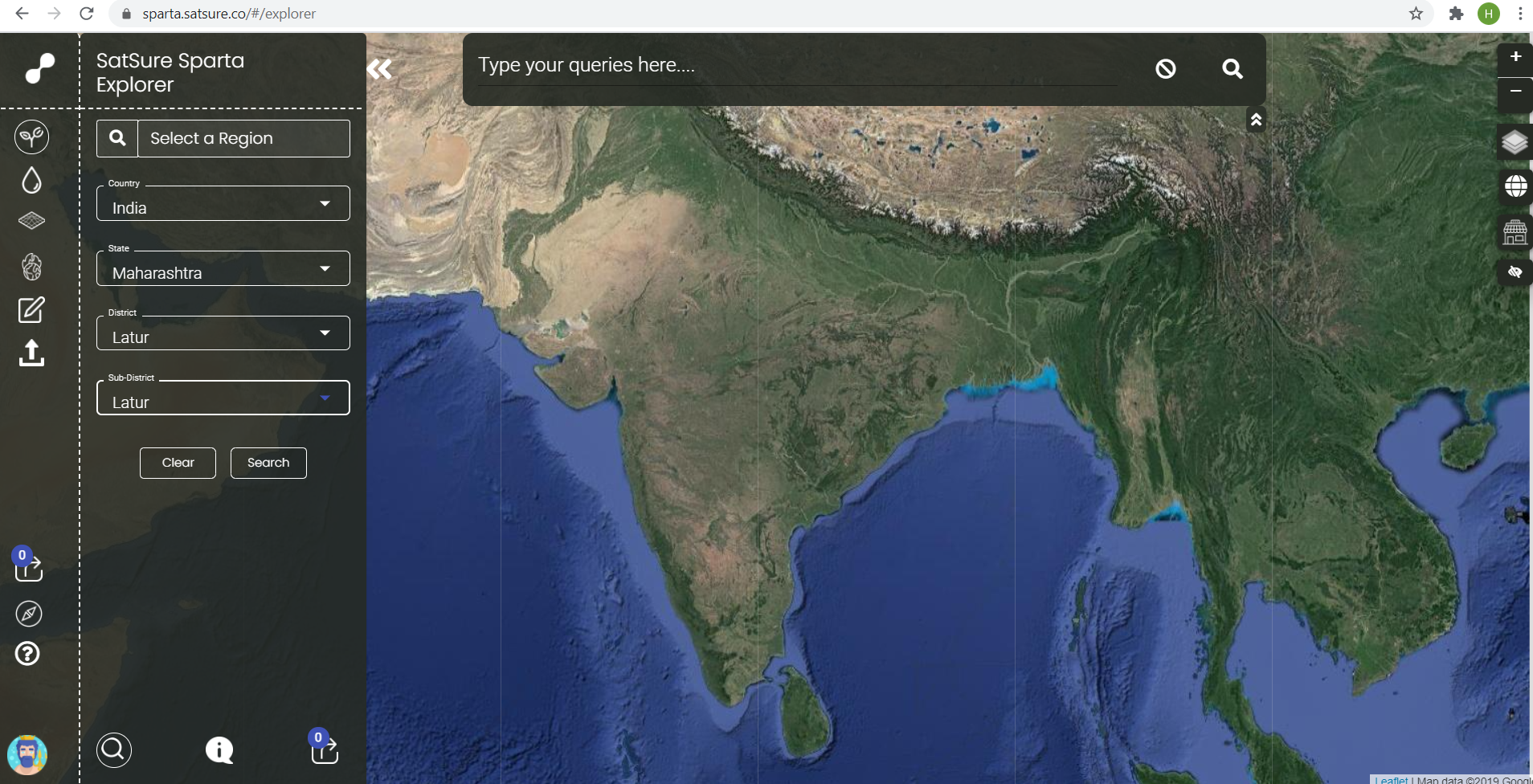
Open SatSure Sparta Data Explorer.
On the left pane, select the crop tab, then select the region of interest from the drop-down list. For this tutorial, the area chosen is Latur District in Maharashtra, India.
Then, Select the Crop drop-down, choose Crop Agnostic and Crop Health Index in the product tab. Then, select the start date and the end date to get the datasets and click search.
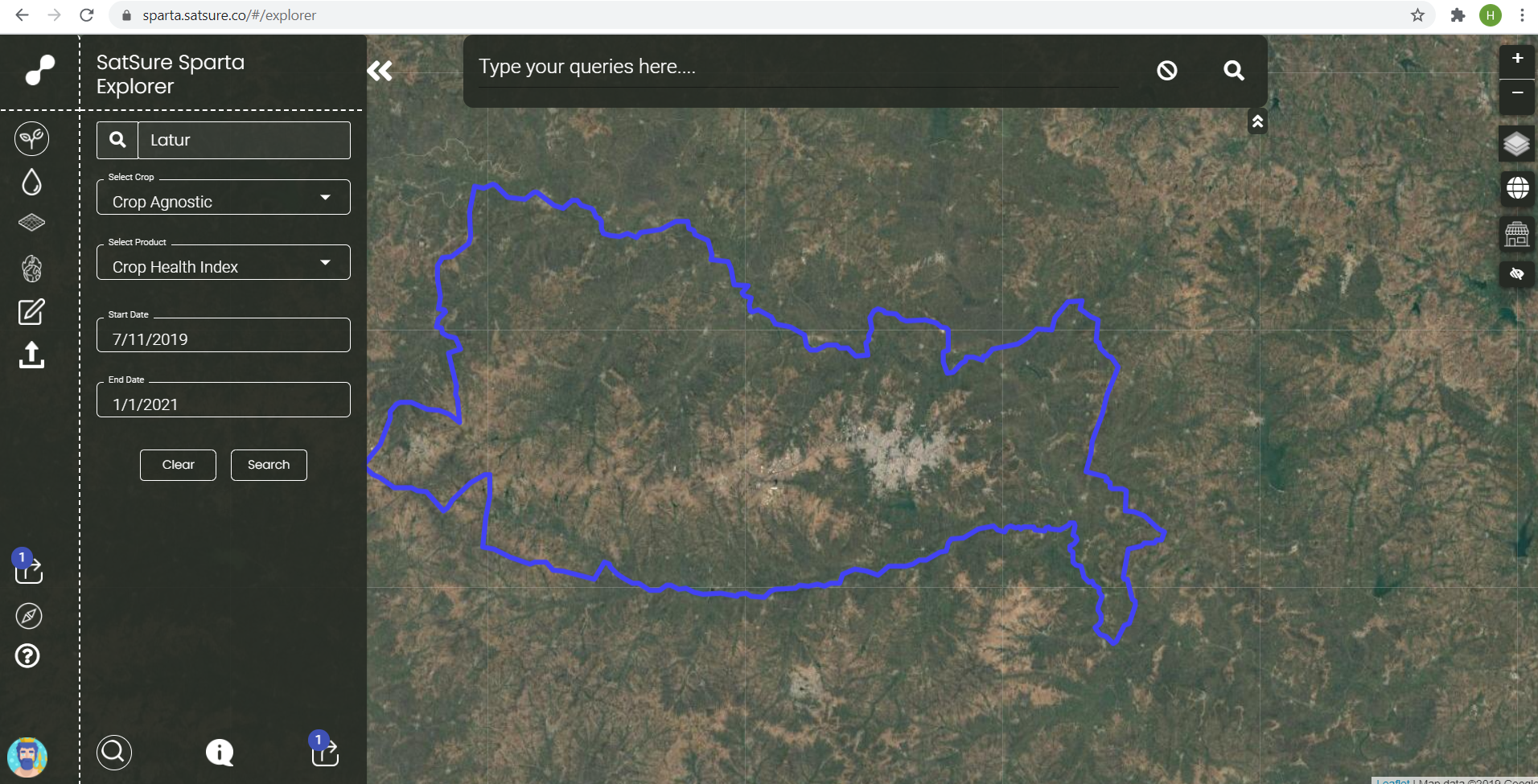
Now, choose the date of image acquisition from the top of the statistics graph and download the image in TIFF format (only available when paid) for further analysis. Download multiple datasets to perform time series analysis.
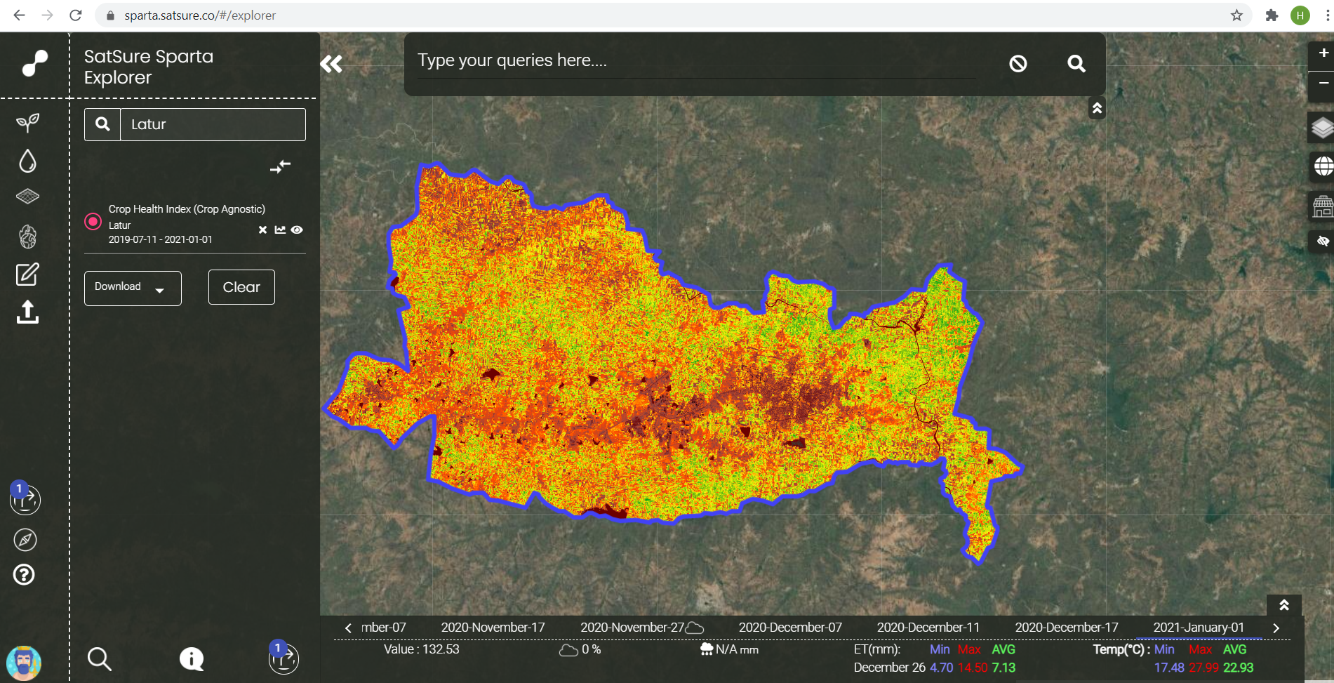
From the given time period, multiple images and a graph showing the variation in health index values over the time period are shown. Other images can be accessed by clicking on the dates on the graph window.
STEPS TO ADD DATA AND VISUALIZE ON QGIS
First, create a new project in QGIS, then import the raw tiff file into the platform.
From the menu toolbar, select Layer > Add Layer > Add Raster Layer.
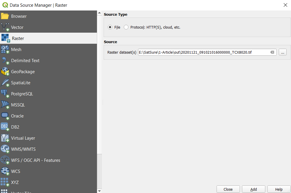
The data source manager tab opens. Browse the tiff file and click add.

The layer will be added to the window. The list of layers added can be seen on the layers window on the bottom left pane.
For better visualisation, right-click on the layer name in the layers tab and select properties.
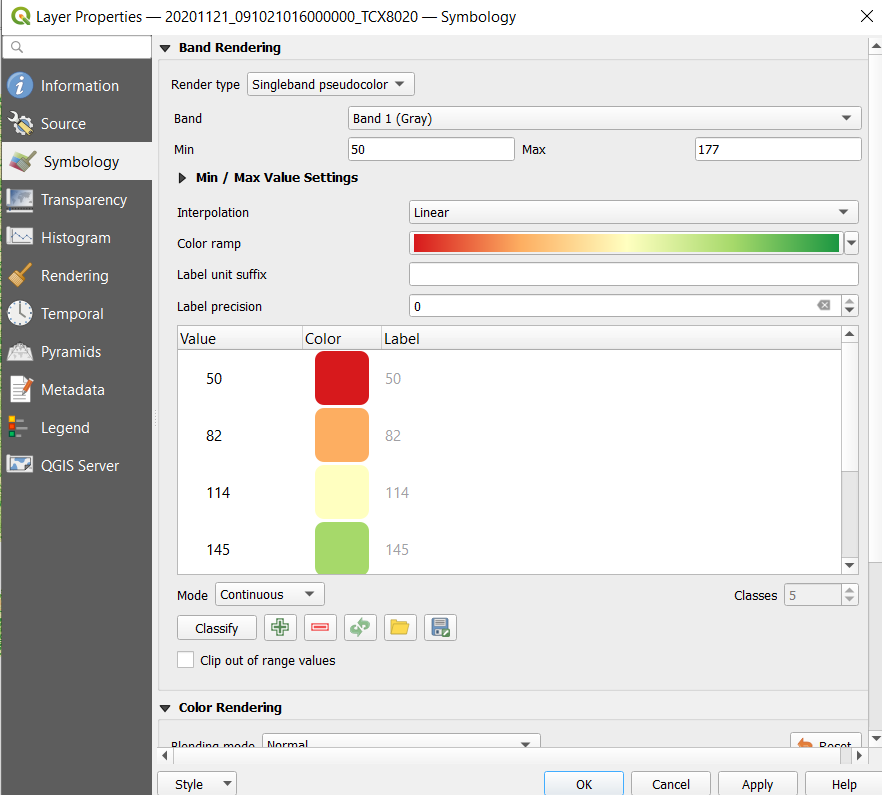
Select symbology.
Choose Single-band pseudocolour in Render type
Choose a colour ramp (In this RdYiGn is chosen)
Click apply

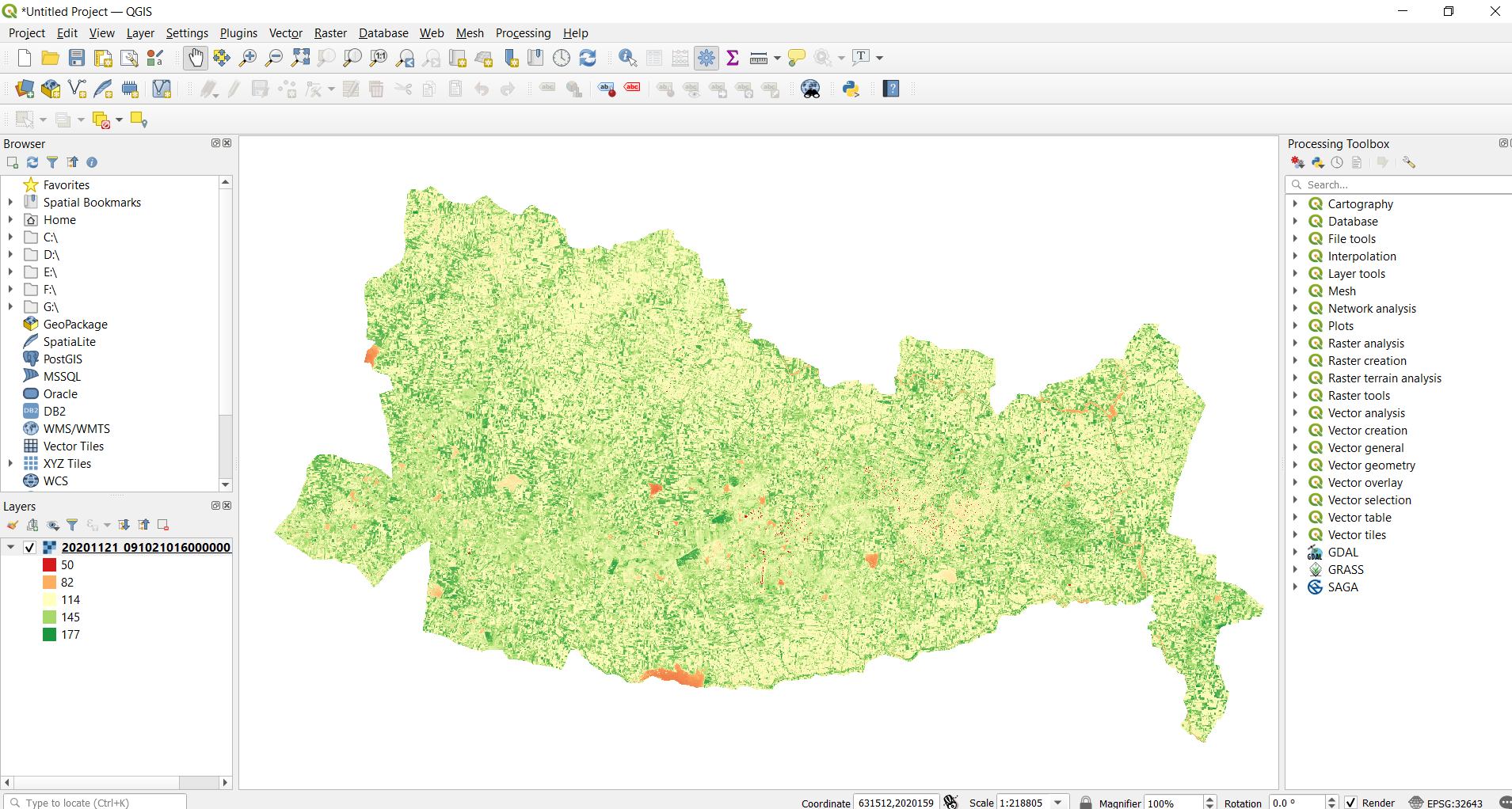
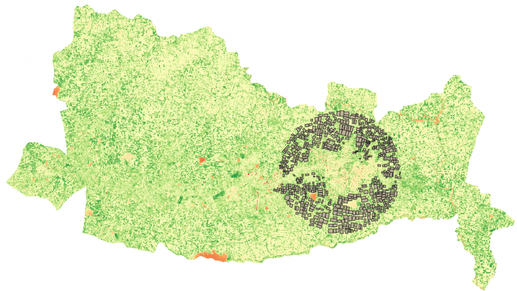
In the above image, the areas in red or pale orange have a low crop health index, whereas areas in green are with good crop health.
STEPS TO PERFORM FARM LEVEL ANALYSIS
In this, we will be using the Zonal Statistics tool to identify the crop health for farms in a particular place.
Additional farm boundaries file (either in .shp or kml) is required. In this, we have used the kml file of farms in the vicinity of 7km from the Latur city centre.
From the menu toolbar, select Layer > Add Layer > Add Vector Layer
Open attribute table to understand the data available before processing.
Right Click on Vector File > Click Open Attribute Table
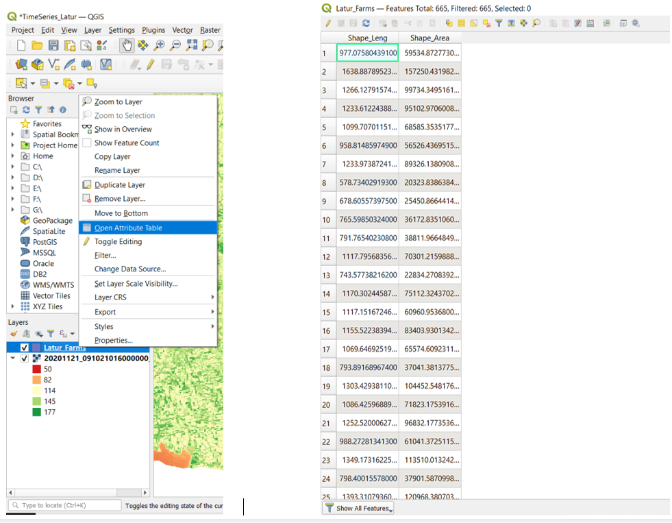
From the attribute table, we see that there are attributes like ID, Shape Length and Shape Area.
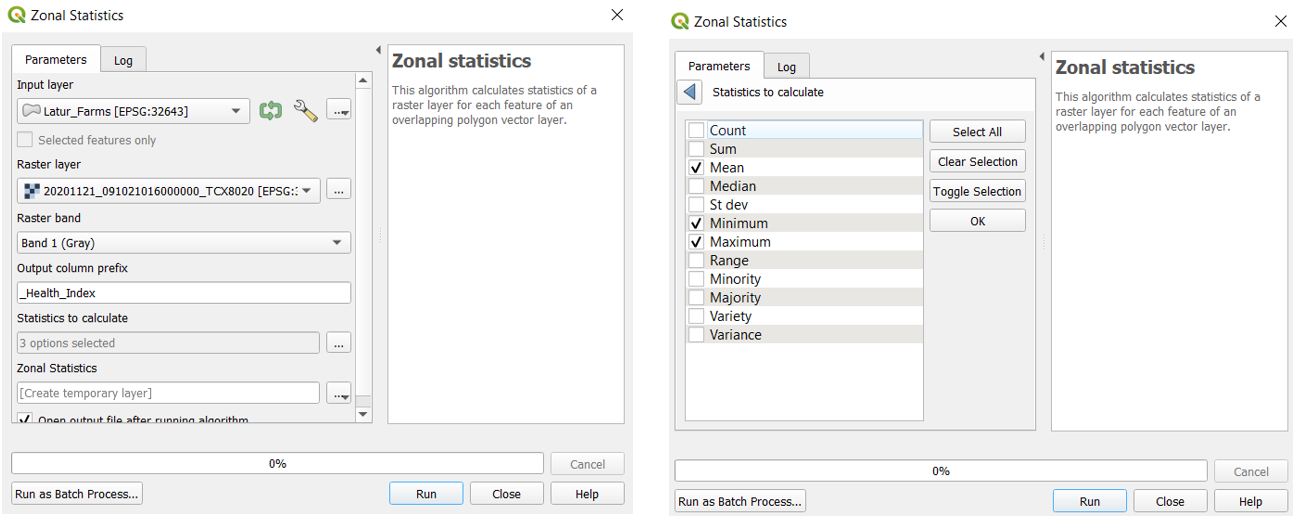
Now, we have to get the value of the health index of each farm in the attribute table. For this, a zonal statistics tool is used.
Open Processing Toolbox > Raster Analysis > Zonal Statistics
The following window opens.
In the Input Layer, select the farms shapefile.
In the Raster layer, select the Health Index Raster.
List of statistics to compute can be calculated from Statistics to Calculate, as shown below.

Now, open the attribute table to check the computed statistics.
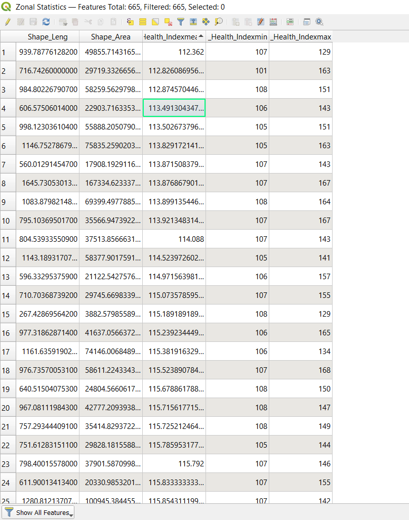

The attribute table now consists of Mean, Minimum and Maximum health index values.
In order to classify the farms based on the health index values, thresholds should be identified as shown below.
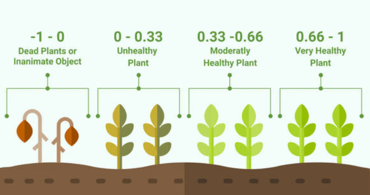
From this, the corresponding Health index values will be as follows:
Dead Plants : 0-100
Unhealthy: 100-133
Moderate: 133-166
Very Healthy: 166-200
Source: Earth Observing System
Change symbology for the zonal statistics file to identify the health of crops in various farms.

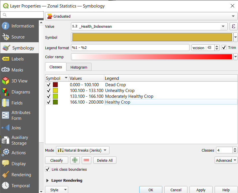
Select Health_Indexmean in the value dropdown
Choose the number of classes as 4 and then click classify.
For each class, choose the colour, input range of values, and the text to be seen in the legend.
Click Ok

The generated map will have a colour for each farm based on the Health Index range of the particular farm.
Further, to select only the farms which have Moderate or Very healthy crop, run a query.
Right Click on zonal statistics Layer > Properties > Source > Query Builder
The query should be as shown in the above image. This input will be taken by clicking on the fields and operators.
Then click on ok followed by apply.
The final output shows the field with moderate or very healthy crops. Similarly, this can be used to identify the farms with unhealthy or dead crops (i.e. from 0-133)
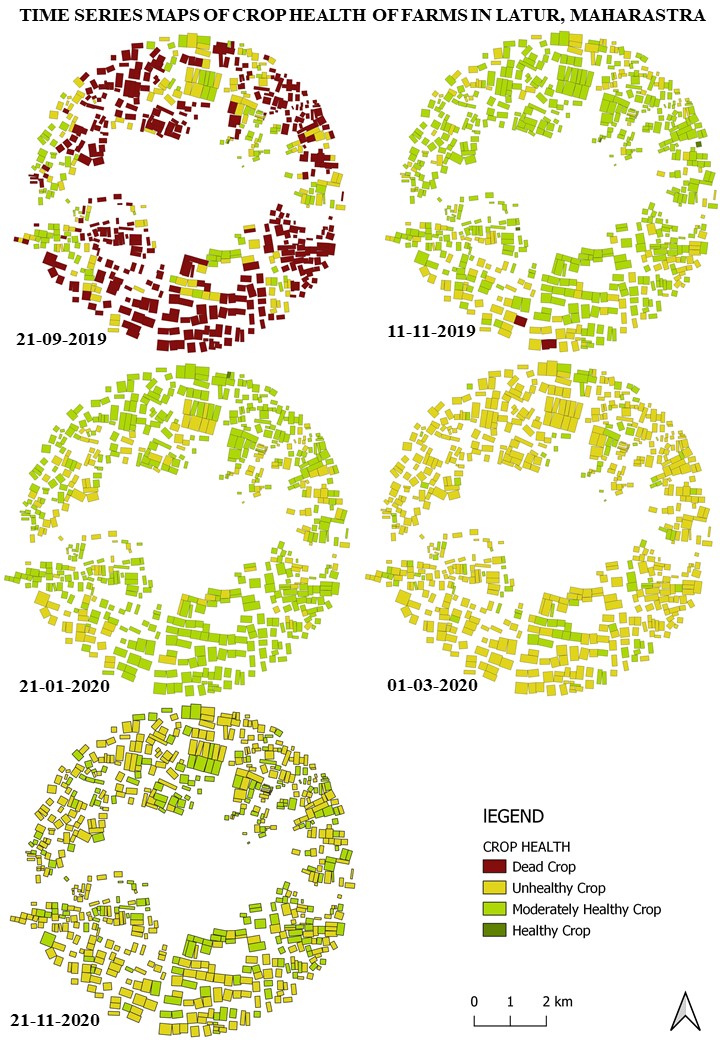
TIME SERIES ANALYSIS
Repeat the above steps for different raster layers acquired in different time periods to perform a time series analysis.

This story was first published on SatSure Sparta Blogs.